Boarding has reached crisis levels across the United States, recently culminating in a letter from ACEP and other national organizations to the President outlining the drastic harms to patients, staff, and clinicians.1 However, despite widespread agreement that boarding is a threat to our specialty and patients, there is lack of consensus on how to visualize, and even define, the boarding crisis. In our emergency department, we recognized that our current metrics do not allow for the many diverse stakeholders—including frontline clinicians, staff, and administrators—to engage with up-to-date boarding data and generate solutions.2,3 Our team aimed to create a blueprint for visualizing boarding that is accessible and scalable at any institution across the United States.
Explore This Issue
ACEP Now: Vol 42 – No 12 – December 2023The Gap
Health systems typically rely on validated scoring systems such as the National Emergency department Overcrowding Score (NEDOCS).4 While these can help quantify boarding severity in real-time, they have limitations when it comes to generating system-level interventions. First, they do not allow for visualization of trends over time, which is critical to identifying drivers of boarding and directing potential interventions. Boarding is associated with several upstream factors, including hospital occupancy and inpatient capacity, and identifying these factors within an institution are critical to implementing the multidisciplinary solutions this problem requires.5,6 Second, NEDOCS rely on several complex inputs that require institutional and real-time operational knowledge, which may limit usability to a small subset of emergency department leadership. Given the broad impact of boarding, democratizing access to information is a powerful tool to create inclusion and source potentially innovative ideas from a diverse group of stakeholders.
Our Approach
We used a design thinking approach to develop an accessible and interpretable visual boarding dashboard for both daily operational and quality improvement use by a broad audience. Design thinking centers the experience of the end-user to create usable products, including iterative prototyping and rapid incorporation of feedback.7 We conducted a comprehensive literature review, 13 stakeholder interviews, and consultation with experts in data management and visualization, aiming to design a single dashboard for utilization by three distinct groups of end-users: frontline clinicians, emergency department management, and hospital-level administrators.
The Final Product

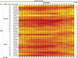
FIGURE 1: Mock-up of internal dashboard displaying boarding heatmap by day and hour. (Click to enlarge.)
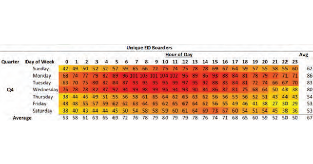
The ZSFG boarding dashboard is a web-based platform that visualizes boarding as a temporal heatmap. The dashboard displays the number of boarded patients by hour in a single snapshot that defaults to the past 32 days (Figure 1) and can also be collapsed to show average boarding by several time periods including by day, week, month, quarter and year (Figure 2). Boarding is defined as any patient still in the emergency department more than 120 minutes from admission request.8 The dashboard can be stratified by age, emergency severity index (ESI), and emergency department length of stay, and other key variables. Data are updated in near real-time from our electronic medical record (Epic Systems) and visualized using Tableau (Tableau Software Version: 2019, Mountain View, CA).
Pages: 1 2 3 | Single Page


No Responses to “An Actionable, Visual Dashboard Approach to Boarding”